

DirectoryCustomize — Visibility Engine — Help
Control what visitors see across your entire directory — member profiles, post detail pages, and any widget — with mode-based gating, per-plan customization, and a visual rules engine.
What it does
Visibility Engine controls what visitors can see across your directory site. It works on three levels:
- Member profiles — gate logged-out visitors with cutoff/fade, paywall, or button-only treatments
- Post detail pages — gate event pages, blog articles, job listings, and all 14 BD post types
- Any widget — show, hide, blur, lock, dim, or replace individual widgets based on who is viewing
The engine does not replace your content — BD still renders everything first, then VE overlays the gating treatment on top. Your SEO stays intact because search engines see the full page content.
Where it lives
In your DirectoryCustomize plugin admin: Plugins → DirectoryCustomize → My Widgets → Visibility Engine.
Four configuration areas across three tabs:
- Profile Settings — mode picker, cutoff options, header button treatment, phone display, CTA card content, per-plan customization, integrations. An info card at the top links to the Visibility Rules tab with the note "Non-profile widget gating is controlled independently in the Visibility Rules tab."
- Visibility Rules — per-widget and per-post-type rule cards with a visual condition builder
- Design — CTA card colors, typography (fonts, sizes, weights), fade height, paywall blur intensity
Saves apply immediately — no rebuild or republish needed.
Two-part install
The Visibility Engine is a two-widget system:
| Widget | Where to install | What it does |
|---|---|---|
| Visibility Engine | Member profile sidebar (or any profile-adjacent zone) | Handles profile page gating — cutoff, paywall, buttons-only modes |
| VE Loader (sitewide) | A sitewide zone (header or footer) | Handles widget gating and post detail page gating across the entire site |
Both widgets are configured from the same panel — VE Loader has no settings of its own.
---
Profile gating
Two-level enable toggle
The Visibility Engine has two switches, not one:
| Toggle | What it controls |
|---|---|
| Enable Visibility Engine (master) | Turns the entire engine on or off -- widget rules, post page rules, and profile gating |
| Enable profile page treatment for logged-out visitors | Nested under the master switch -- controls whether profile pages are gated. Master ON + Profile OFF means widget rules and post page rules run, but member profiles are not gated. |
This lets you configure and test widget/post rules without affecting live profile pages.
Mode picker
The mode controls how logged-out visitors experience member profiles.
| Mode | Best for | What the visitor sees |
|---|---|---|
| Buttons only | Public directories where listings should stay visible but action buttons drive sign-up | Full profile content visible, but Send Message / See Phone / Write Review buttons redirect to your sign-up flow |
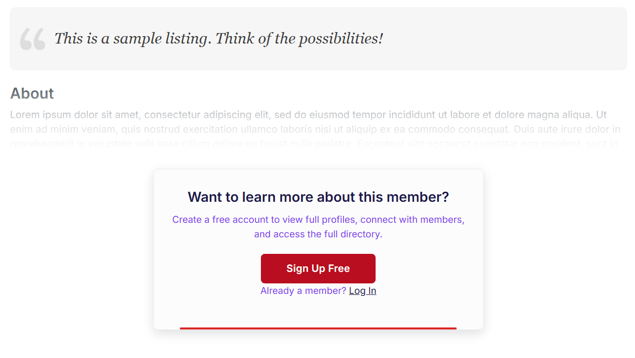
| Cutoff & Fade | Most directories — balances value and gating | Profile renders up to a chosen element, then fades out with a CTA card below |
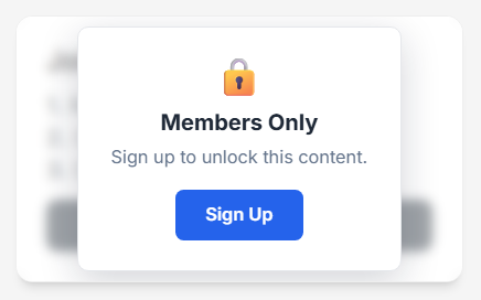
| Paywall | Premium directories where content is the paid benefit | Full profile blurred behind a CTA overlay card |
When Visibility Rules are active and override the Mode setting for some visitors, a yellow warning banner appears at the top of the Profile Settings tab showing which verdicts are in effect (e.g. "currently forcing: Paywall, Cutoff & Fade") with a link to edit the rules. The Mode value serves as the fallback for visitors that don't match any rule.
Cutoff mode options
When mode is Cutoff & Fade, extra fields appear:
| Setting | Default | What it controls |
|---|---|---|
| Cutoff after which element | After About | Where the fade begins — options listed shortest to longest: Header only · After Tab Nav · After Quote/Slogan · After About · After 1st/2nd/3rd content section |
| About text character limit | 250 | Truncates the About text after N characters before the fade (only when cutoff = After About) |
| Other profile tabs | Keep all tabs | What happens to Specialties / Reviews / Photos / any tab beyond Overview. Options: Keep all · Dim · Disable · Hide entirely |
About the "After Tab Nav" option — this shows the tab BUTTONS but fades the tab CONTENT. Visitors see there are more tabs (Reviews, Photos, Specialties) without seeing what's in them, which drives sign-up curiosity. It's the strongest teaser pattern.
Header buttons treatment
The Send Message / See Phone / Write Review buttons at the top of the profile have their own behavior, independent of the mode:
| Treatment | What happens |
|---|---|
| No change | Buttons work as normal |
| Dim | Visible but partly transparent — still clickable |
| Disable | Visible but greyed out and unclickable |
| Rename + redirect | Replace each button's label and link with your sign-up CTA |
| Hide entirely | Remove the buttons completely |
When you pick Rename + redirect, three text/URL pairs appear so you can customize each button independently — useful for tracking which button drives the most sign-ups (set different UTM params per button).
Phone number in profile body
Separate from the header See Phone button, the profile body has a phone row showing the actual digits. The engine treats this independently:
| Mode | What it does |
|---|---|
| Show | Phone visible as normal |
| Hide | Remove the phone row from the profile body |
| Mask | Replace digits with •••••• (preserve the row layout) |
| Replace | Show a custom prompt that links to sign-up |
Common pattern: keep the header "Sign Up to See Phone" button visible as a sign-up driver, but Hide or Mask the digits row so logged-out visitors can't read the number elsewhere on the page.
CTA card
The CTA card is the only piece the engine renders itself — everything else is BD's native content with overlays on top. Seven fields control its content:
| Field | Default | Use |
|---|---|---|
| CTA heading | Want to learn more about this member? | Top line of the card |
| CTA subtitle | Create a free account to view full profiles... | Subtext under the heading |
| Button text | Sign Up Free | Call to action label |
| Button URL | /join | Where the button sends visitors |
| Help prompt text | Already a member? | Smaller line under the button |
| Help link text | Log In | The clickable link text next to the prompt (configurable — was hardcoded in earlier versions) |
| Help URL | /login | Where the help link sends existing members |
---
Post detail page gating
The Visibility Engine can gate entire post detail pages — not just member profiles. This covers all 14 BD post types:
| Post type | Icon |
|---|---|
| Events | Calendar |
| Blog Articles | Pencil |
| Jobs | Briefcase |
| Videos | Video |
| Coupons / Deals | Tag |
| Discussions | Comments |
| Audio | Headphones |
| Community Articles | Users |
| Classifieds | List |
| Products | Shopping cart |
| Properties | Home |
| Photo Albums | Camera |
| Digital Products | Cloud download |
| Articles | Newspaper |
How to gate a post page
- Open Visibility Rules tab
- Click Gate a post page in the toolbar
- Pick a post type from the dropdown (already-added types are greyed out)
- A new rule card appears for that post type — set conditions and a verdict
- The VE Loader widget (installed in a sitewide zone) evaluates these rules when a visitor lands on any post of that type
Post page rules support these verdicts:
| Verdict | What it does |
|---|---|
| Hide | Completely removes the post content from the page |
| Blur | Content visible but blurred (no sign-up prompt) |
| Cutoff & Fade | Shows the post up to a chosen element, fades the rest, CTA card below |
| Lock | Blurs content and shows a sign-up overlay card with full CTA customization |
| Dim | Partial opacity, still clickable |
| Inert | Visible but all interactions disabled |
| Replace | Swaps the post content with custom HTML |
| Redirect on click | Sends any click on the page to a URL — works even over embedded video and iframes |
Cutoff & Fade options for post pages
When you choose Cutoff & Fade on a post page rule, an element picker controls where the content cuts off:
| Cutoff element | What visitors see |
|---|---|
| After title | Post title only, everything below fades |
| After image (default) | Title + featured image visible |
| After first section | Title, image, and the first content section |
| After description | Title, image, and the description text (with a character limit field to truncate long descriptions) |
Below the cutoff, a CTA card appears with full per-group customization: heading, subtitle, button text, button URL, help prompt text, help link text, and help URL. Each rule group can have its own CTA content -- for example, one message for logged-out visitors and a different upsell for free-tier members.
The CTA card uses position: sticky so it stays visible at the top of the viewport on long post pages instead of rendering below the fold.
---
Post page action buttons
When a post detail page is gated (events, listings, jobs, etc.), the page still has action buttons -- typically Contact Member and More Details (or RSVP, Apply, etc. depending on post type). The post action buttons section lets you control those buttons independently from the page gating verdict.
This section appears inside each post page rule card and each widget rule card that uses a cutoff or lock verdict. For post page rules using the lock verdict, the full CTA card customization (icon, heading, subtitle, button text/URL, help prompt, help link, help URL) is also available alongside the button treatment -- so both the overlay card and the action buttons can be customized per rule group.
Button treatment
| Treatment | What happens |
|---|---|
| No change | Buttons work as normal |
| Dim | Visible but partly transparent -- still clickable |
| Disable | Visible but greyed out and unclickable |
| Rename + redirect | Replace button labels and URLs with your sign-up CTA |
| Hide | Remove the buttons entirely |
Rename + redirect fields
When you pick Rename + redirect, four fields appear in a 2x2 grid:
| Field | Default placeholder | What it controls |
|---|---|---|
| Contact button text | Sign up to contact | Label on the Contact Member button |
| Contact button URL | /join | Where the contact button sends visitors |
| Details button text | Sign up for details | Label on the More Details / RSVP button |
| Details button URL | /join | Where the details button sends visitors |
Common pattern for events: set Contact button to "Log In to Contact Host" with URL /login, and Details button to "Log In to RSVP" with URL /login. This turns the event page buttons into login prompts without hiding the event content.
Each post page rule card and each configurable widget verdict card has its own button treatment settings, so you can apply different treatments to different post types or widgets.
---
Widget gating (Visibility Rules)
Beyond profiles and post pages, VE can gate any individual widget on your site. Rules evaluate top-to-bottom and the first matching group wins.
Adding widget rules
Click Add widget rule to open the widget picker. It has two tabs:
Tab 1 — Pick an installed widget has three numbered options:
| Option | What it shows | When to use |
|---|---|---|
| Option 1 — Select a widget with a known class | 100+ pre-mapped BD widgets (including all 15 homepage sections) from the VE selector map, gated by CSS class with no wrapper needed | Best for common BD widgets -- fastest, no ambiguity |
| Option 2 — Select a widget installed on your site | A live list of all widgets on your site, each showing a DC/BD/Custom badge and whether it uses a native class or requires wrapping | When you want to gate a specific installed widget not in the pre-mapped list |
| Option 3 — Customize a BD default widget not on your site yet | Type-ahead search over the full 510-widget BD catalog, with a deep-link to BD admin to customize it first | When you want to gate a BD widget that is not yet customized/installed on your site |
Tab 2 — Gate by CSS selector lets you gate any DOM element by entering a friendly name and a CSS selector (e.g. .related-members-links). The panel includes instructions for finding selectors via browser DevTools (right-click an element, Inspect, copy the selector). CSS selector rules show a purple CSS badge on their rule card.
Use Tab 2 when: a BD widget is not in the pre-mapped list, you want to gate a specific page section or third-party block, or you need to target a custom DOM element.
Once you pick a widget or enter a selector, a new rule card appears.
The toolbar
The Rules tab has a sticky toolbar at the top with:
- Add widget rule — pick a widget to gate
- Gate a post page — dropdown showing your site's post types, with custom types at the top and standard BD types below. The list pulls dynamically from your site so any custom post types you create automatically appear.
- Expand all / Collapse all — manage long rule lists
- Presets — one-click rule templates (see below)
- Filter bar — search/filter rules by name, verdict type (blur, lock, hide, etc.), or rule kind (widget, page, post page). Appears when you have multiple cards. Each card generates filter tags for faceted filtering.
Rule presets
Presets add pre-built rule templates with one click. Nine active presets:
| Preset | What it does |
|---|---|
| Gate from visitors | Hides the widget from logged-out visitors |
| Show full for paid members | Paid plan members bypass gating (opens a plan picker) |
| Upsell free tier | Free members see a blurred version with upgrade prompt (opens a plan picker) |
| Never gate admins | Admin-role viewers always see full content regardless of other rules |
| Business hours only | Content visible during business hours, gated outside them |
| Weekend open house | Opens gated content on weekends |
| After-hours access | Grants access outside business hours (inverse of Business hours only) |
| Mobile paywall | Gates content on mobile devices while keeping desktop open |
| Desktop only widget | Hides the widget on mobile, shows on desktop |
The presets panel also shows upcoming presets marked Coming Soon (greyed out and unclickable): URL parameter trigger, Referrer-based access, Gate stale listings, Seasonal/date range, Launch day countdown, and Geo-lock content. These are planned but not yet functional.
How rules are organized
Rules live in rule cards — one card per widget or post type that you gate. Inside each card:
- An on/off toggle in the card header — turn a whole rule off without deleting it. You can keep more than one rule card on the same target (widget or page) and switch which one is active: turning one on automatically turns off the other cards on that same target, so only one runs at a time.
- A default action dropdown sets the verdict when no rule group matches
- One or more rule groups each return a specific verdict when their conditions match
- Groups can be enabled/disabled independently and reordered using up/down arrow buttons on each group
- When two or more groups exist, a blue info banner appears: "Order matters -- rules evaluate top to bottom. The first matching group wins. Use the arrows to reorder."
- Groups that use configurable verdicts (lock, replace, badge, redirect, blur) show an inline customizer panel
All verdict types
| Verdict | Available for | What it means |
|---|---|---|
| Show | Profiles, widgets | Override the gate — show content in full |
| No engine action | Profiles | Widget uses its own settings, engine takes no action |
| Hide | Profiles, widgets, post pages | Completely remove content from the page |
| Blur | Profiles, widgets, post pages | Content visible but blurred (no sign-up prompt) |
| Lock | Widgets, post pages | Blur content + show a sign-up overlay card |
| Dim | Widgets, post pages | Partial opacity, still clickable |
| Inert | Widgets, post pages | Visible but interactions disabled |
| Replace | Widgets, post pages | Swap content with custom HTML or another widget |
| Badge | Widgets | Corner tag, no functional change to the widget |
| Redirect on click | Widgets, post pages | Send any click to a URL — works even over embedded video and iframes |
Verdict customizer
When you pick a configurable verdict, a customizer panel opens inline below the verdict dropdown:
Blur verdict — enter blur intensity per rule group: light, medium (default), or strong. This is separate from the Design tab's paywall blur slider -- it controls per-rule blur strength.
Lock verdict — by default uses a standard lock card (lock icon, "Members Only" heading, "Sign up to unlock this content" subtitle, sign-up button). Uncheck "Use the standard lock card" to customize: icon (emoji or image URL), heading, subtitle, button text, button URL, help prompt text, help link text, help URL. On post page rules, the lock customizer also includes the full CTA card fields and button treatment section.
Replace verdict — two modes via radio buttons: Custom HTML (a textarea to enter markup that replaces the widget content) or Another widget (a widget picker that swaps the gated widget's content with a different widget from your site -- pick, change, or clear the replacement widget).
Badge verdict — enter badge text, pick a color (color picker + hex input), pick a position (four corner options), and optionally check Reserve space so the badge does not overlap content (adds padding on the badge side instead of floating over the corner).
Redirect on click — enter the destination URL.
Context keys — what you can match on
| Key | Value type | What it captures |
|---|---|---|
| Auth status | Logged in / Logged out | Is the viewer signed in? |
| Viewer role | Admin / Member / Anonymous | Account type of the visitor |
| Viewer plan ID | Numeric | Subscription ID of the visitor |
| Viewed profile plan ID | Numeric | Subscription ID of the profile being viewed |
| Page type | Member profile | Which BD page template is rendering |
| URL path | Text | Request URI path |
| Referrer URL | Text | Where the visitor came from |
| Device type | Mobile / Desktop | Detected from User-Agent |
| Time of day | 0--23 | Server-time hour (shown with AM/PM labels in the picker) |
| Day of week | Sunday--Saturday | Day of the week |
| Listing age (days) | Numeric | Days since the profile/post was created |
| Viewer Custom Field | Dynamic | Any custom field from the logged-in viewer's profile (Contact Details, Additional Details) |
| Post Custom Field | Dynamic | Any custom field from the viewed post or listing |
Custom field rules
The Viewer Custom Field and Post Custom Field keys let you build rules based on any custom field on your site. When you select either one, a second dropdown appears showing all available fields from your database, organized in two groups:
- Custom Fields — fields you or your site admin added (shown first)
- Standard Fields — built-in BD fields like Post Date, Post Clicks, etc.
When you pick a field, the value dropdown populates with the actual values that exist in your data. If a field is brand new and no posts have been submitted with it yet, you can type the value manually — it works the same way. To seed the dropdown with options, create a test post with that field filled in.
Just added a field in Form Manager? Click the small refresh icon (↻ Refresh fields) right next to the field dropdown to reload the field list immediately — no page reload needed. Newer and renamed form fields appear here too, including fields that don't have their own database column (BD stores those separately, and the rules engine reads them the same way when the post has been saved with a value).
Tip for checkbox fields: If your form uses checkboxes where multiple options can be selected (like an Audience field with "Consultants" and "Nonprofits"), BD saves multiple selections as a comma-separated value like consultants,nonprofits. Use the contains operator instead of equals so your rule matches whether one or both options are checked. For example, Post Custom Field: filter_by_audience contains consultants will match posts where only Consultants is checked AND posts where both Consultants and Nonprofits are checked. Using equals on consultants would miss posts where both are checked.
Operators
The operator dropdown filters automatically to only show operators valid for the chosen key's value type.
| Operator | Works with |
|---|---|
| equals / does not equal | Enum, ordinal, numeric, text |
| is one of / is none of | Enum, ordinal, numeric, text (comma-separated list) |
| is empty / is not empty | Enum, numeric, text |
| greater than / less than / >= / <= | Numeric, ordinal |
| is between | Numeric, ordinal (min, max) |
| contains / does not contain | Text |
| starts with / ends with | Text |
AND / OR tree
Rule groups use an alternating-depth pattern:
- The root of each group picks AND or OR
- Nested groups alternate automatically — if root is AND, children are OR, grandchildren are AND again
- Each level shows a pill button labeled with its operator — click to add conditions or nest deeper
Example rule patterns
Block paid-tier profiles from logged-out viewers, free-tier visible to anyone
Default: show
Group 1: When (Viewed plan ID is one of: 5,7,12) → blur
Show full profile on mobile after hours, gate during business hours
Default: hide
Group 1: When (Device = Mobile) AND (Time of day >= 18 OR Time of day < 8) → show
Gate events by audience field (only consultants can see consultant-only events)
Default: show
Group 1: When (Post Custom Field: filter_by_audience contains consultants) AND (Auth = Logged out) → lock
Group 2: When (Post Custom Field: filter_by_audience contains consultants) AND (Viewer plan ID = 5) → lock
The first group locks logged-out visitors. The second locks free-tier members (plan 5) who are not consultants. Consultant-tier members see the full event.
Always show admins the full profile
Default: hide
Group 1: When (Viewer role = Admin) → show
Gate event pages for non-members
Post page: Events
Default: show
Group 1: When (Auth = Logged out) → lock
---
Per-plan customization
Override any CTA field for a specific membership plan. The plan picker shows all your membership plans — including non-searchable plans (marked with "no profile" in the dropdown).
For each plan you can override:
- Mode (Buttons only / Cutoff / Paywall)
- About excerpt character limit
- CTA heading, subtitle, button text, button URL
- Help prompt text, help link text, help URL
Leave any field blank to inherit the default. Each plan stores its own overrides — switch between plans in the dropdown to configure each one. Changes autosave 1.5 seconds after you stop typing. Use the Clear overrides button to reset a plan back to defaults.
Per-plan customization uses the viewed member's plan (not the visitor's plan). When a visitor views a premium member's profile, they see that plan's customized CTA; when they view a free member's profile, they see the free-tier CTA.
---
Design tab
The Design tab gives you complete visual control over the CTA card, sign-up button, and overlay effects. Everything else on the page inherits your site's native styling so the gated treatment blends in.
Design presets
At the top of the Design tab, a color preset picker lets you apply a complete color theme to the CTA card and overlay in one click (e.g. Bootstrap, Shoreline, Ember, and 25+ others). Two refinement controls:
- Tint offset — a slider from -30 to +30 that shifts lightness across the entire preset palette, letting you darken or lighten the theme without hand-picking colors
- Rotations — variant color arrangements within the same preset (different accent/background combinations)
Some presets are locked as premium -- unlockable presets show a lock icon. Select a preset, adjust tint and rotation, then fine-tune individual colors below if needed.
Colors
CTA card — Background, border, corner radius (Square / Subtle / Rounded / Pill), shadow (None / Subtle / Medium / Strong).
Headline & body — Heading color, subtitle color, login link color.
Sign-up button — Background, text color, size (Small / Medium / Large / Extra Large), corner radius (Square / Subtle / Rounded / Pill).
Typography
Full font control for every text element on the CTA card — each section lets you pick a font family, size, and weight. Font families show each option rendered in its own typeface so you can preview before selecting. Weight options show their actual weight for quick comparison.
CTA heading — Font family (15 fonts), font size, weight (Normal through Extrabold).
CTA subtitle — Font family, font size, weight (Light through Semibold).
Sign-up button — Font family, weight (Normal through Bold). Button size is set in the Colors section.
Overlay effects
Cutoff fade — Fade height (None / Subtle / Medium / Strong) — controls how tall the gradient is before the CTA card.
Paywall blur — Blur intensity with a live preview (Hint / Subtle / Medium / Strong) — controls how much of the content is readable behind the overlay.
---
Integrations
The Visibility Engine connects with other DirectoryCustomize widgets when both are installed. Each integration appears as its own card on the Profile Settings tab.
Highlighter integration
The Highlighter widget styles individual tabs (Reviews, Premium, etc.) with ribbons, glows, and animations. VE connects to it in two ways:
| Toggle | What it does |
|---|---|
| Keep highlighted tabs visible when hiding tabs | When Other tabs treatment is set to Hide, tabs that Highlighter has marked stay visible alongside Overview. Logged-out visitors see exactly which premium tabs they would unlock. |
| Apply Highlighter effect to sign-up CTA box | Adds a Highlighter animation (corner ribbon, pulse glow, gentle throb, shimmer sweep, bounce, underline fill) to the CTA card so it pops. Works in all modes. |
| Highlighter style for CTA box | Pick which animation to apply, or leave empty to inherit Highlighter's site-wide default. |
Both toggles are mirrored on Highlighter's own Configure panel — saving in either place updates the other.
DirectoryAds integration
When DirectoryAds is installed and Show ad slots behind paywall blur is on, ad zones render behind the blurred profile content in paywall mode. You monetize the impression even when the visitor cannot see the profile. Only applies in paywall mode.
---
How settings are stored
VE settings are stored separately from the widget code (in widget_settings). This means:
- Reverting the widget to BD's default or reinstalling a DC override only swaps the underlying code — your CTA text, mode picks, rules, design colors, and per-plan overrides carry over to the new version
- Settings persist across plugin updates
- Multiple widgets can read VE settings (the member-profile widget reads them at render time)
When you save, VE automatically clears the render cache for both itself and any consumer widgets (like member-profile) so changes appear on the live site immediately.
---
Common questions
Need more help?
If a rule isn't behaving the way you expect:
- Open the Visibility Rules tab and review your rule groups top-to-bottom
- Check which group matches the visitor's context and what verdict it returns
- If a group fires that shouldn't -- review its conditions (the operator filter prevents most nonsense matches, but typos in text values can slip through)
- If no group fires when one should -- check that the group is Enabled (the checkbox at the top of each group)
- Check the Profile Settings tab for the yellow rules-override banner -- it shows which verdicts are currently active
Still stuck? Contact support with:
- Your directory URL
- The visitor's context (auth state, plan ID, device, page they were viewing)
- A screenshot of your Rules tab showing the groups in question